Marketing content is stronger with subheadings.
Marketing content is the fuel that drives the Internet.
As you know, reading from a screen is difficult compared to printed text. That’s not to say that your intellect suddenly falls several points when faced with a computer screen, but that reading from a back-lit screen is tiring on your eyes, which leads to reduced concentration levels.
That’s why it’s essential to use subheadings – a feature used by every professional copywriter – because they help readers maintain concentration.
How subheadings impact your marketing content
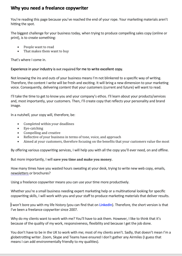
The best way to show you the effect subheadings is by showing you a sample copy taken from my About Us page – first without any subheadings:

As you can see, even with the paragraphs intact, the piece doesn’t make you want to read. The text looks too dense, and there is no direction for the page’s information.
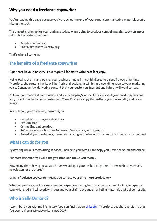
Now let’s look at it again with the subheadings in place:

This time, there is much more structure to the page. The subheadings act as signposts telling the reader what information the page contains, making navigating to the section they want to read easier.
The aesthetics of subheadings
Aesthetically, the page looks more inviting with subheadings: a solid wall of text gives the impression that the subject matter will be difficult to read and boring, so it won’t encourage people to give up their valuable time to read it.
With subheadings, the reader can break the page down:
- The subheadings act as rest points; the reader can break off anytime and keep their place.
- They can glance down the page and pick out the information they need
- They give the impression of an ‘easy read’, which subconsciously suggests the information will be easy to grasp
So, simply including subheadings in your writing can boost its readability.
Next time you write website copy, brochures, blogs, or articles, pay special attention to how you lay the information out. Use subheadings and short paragraphs to make it easy to follow and understand, boosting your engagement with your readers.